Every season the styles and trends change. It’s exciting to see what’s hitting the stores as we shop for new items. But just because something is “on trend,” it doesn’t mean it will work for you! In fact, certain colors may actually make you look older than you are, or more tired.
So I’m going to help you look for clothing, home décor, and accessories that will last you beyond just this summer. Here’s what I mean.
In my system of Energy Profiling and Dressing Your Truth, I teach that there are 4 Energy Types, and every single person expresses a dominant Type. You can easily find out which one you are by going through my free Beginner’s Guide here. When you discover your true Energy Type, everything in your world will start to make sense!
In Dressing Your Truth, we love color! I teach you how to use color to express yourself and show off your personal style.
If you haven’t noticed, I really love colors myself. I like dynamic and bold accessories and find all kinds of fun things to add to my wardrobe each season. I want to discuss some of my favorite colors for this year.
Summer 2021 Color Trends
Before we get into the color palette, I want to encourage you to grab your Style Kit. This will help you immediately know whether or not one of the trending colors is best for your Energy Type!
When looking to see if a color belongs to a certain Type, you want that color to harmonize with the other colors on that specific Style Guide. The color will look as though it could be another square on the card. If it looks like it “jumps out” or “stands out” from the rest, you can be confident it’s not that Type!
Pantone Color Institute always gives a Pantone Color of the Year and then chimes in on the colors used for each season on the Fashion Week New York runways. This year Pantone noted that the palette for summer was “friendly and relatable.” The colors are a fantastic blend of the classics with youthful vibes. Hot flame scarlet to reliable faded denim, you can get all kinds of looks out of the summer color palette for 2021.
Before buying anything new, look to see if you have items that already fit the popular trends! You can look through your closets and makeup drawer to pull these colors out as trendy items for this season. From clothing to home décor, you might be surprised at how old items can be refreshed as they are paired or used in new ways.
Use this guide to help you choose stylish wardrobe pics for 2021! If you are needing a new pair of shoes, tops, bottoms, accent jewelry or sunglasses, check out the popular 2021 style colors before you go shopping! If you are repainting a wall or purchasing a few room accents to refresh a space, this It a great guide to help you get started.
7 Top Summer Colors to Wear
You can’t beat the heat this summer, but you can certainly join in! These hot colors are sure to create eye-catching looks that will help you stand out from the crowd. Choose the colors you like, the ones that compliment your complexion or the colors that will help boost a weaker chakra!
1. Flame Scarlet
This fiery red holds no punches. From a lip color to a fierce dress, flame scarlet is undoubtedly the color of unrestrained passion. Use the intense energy of this color to help support your root chakra and sacral chakra. This color exudes confidence and will help you “fake it ‘til you make it” if you are struggling to find your inner power. Bright colors can naturally add confidence to your look as you get more comfortable wearing them.
2. Faded Denim
Worn, comfortable and soothing—faded denim is a great soft summer color that pairs well with so many other colors. Denim can make a great jacket or pair of shorts. This familiar blue color provides feelings of reliability. Faded denim is relatable and down-to-earth for a style that isn’t too wild. You can dress it up with detailing, embroidery, lace or beading. You can dress denim down by bleaching further, fraying cut edges, adding patches or creating distressed holes.
Blue is associated with empowering the throat chakra, so you may find that you can express yourself a bit easier when you are focused on adding blue to your outfits.
3. Biscay Green
The refreshing and calming cool aqua green color is a fantastic light summer color, and I’m happy to see it in the 2021 palette! This color has rejuvenating and stable energy. The heart chakra is supported with green and Biscay green will even give you a bit of the blue that supports your throat chakra. This is kind of an old fashioned color that has recently been brought back into the spotlight with new fervor!
4. Coral Pink
Another old color brought back into the trending spotlight! Coral pink is the soft, feminine color that gives us a throwback to the 50s. It really pairs well with the faded denim or chive color trends, though many colors play well with it. Pink is a lighter tint of red, so this color is one that will support your root chakra and enable action. A strong root chakra that is open and connected to your upper chakras is going to help you experience confidence free of anxiety or insecurity.
5. Saffron Yellow
This warm and earthy yellow has a natural draw to your solar plexus chakra and is a true summer color. It is the color of yellow leaves just between green and brown during autumn, so this is one you will be able to keep using into fall. It is also the color of sunflower petals and summer squash. This color has an energy that is inspiring and yet soothing.
Yellow can be a tough color for some to wear with their complexion (especially the paler skin tones), but that doesn’t mean you can’t use this as an accent for shoes or jewelry! Yellow sapphires and yellow diamonds are beautiful stone choices that would support your solar plexus energy center.
6. Chive Green
This earthy green is one of my personal favorites. It has restorative properties like those often found in nature. Chive green can be used as a neutral hue, so use it like you would khaki or stone grey. Boots, pants, scarves, blouses and so many other items can be found in this color for summer. It is going to be a good one to keep around for fall as well! Green supports the heart chakra, so use chive to boost your natural empathy.
7. Brilliant White
White is a fantastic color that shows up almost every spring and summer. It has a crisp, professional look that brings integrity, honesty and even purity with it. It can be very hard to keep white clothes clean, so consider what clothing you are choosing for your white items. Pants, for example, can be stunning in white, but stain easily if you sit on the wrong surface or accidentally drop a bite of food in your lap! A white purse, shoes or bracelet could be a better choice for times when staying clean won’t be as easy.
White is sometimes associated with the crown chakra as a color of wisdom. You can use white to support ethereal thinking and inspiration.
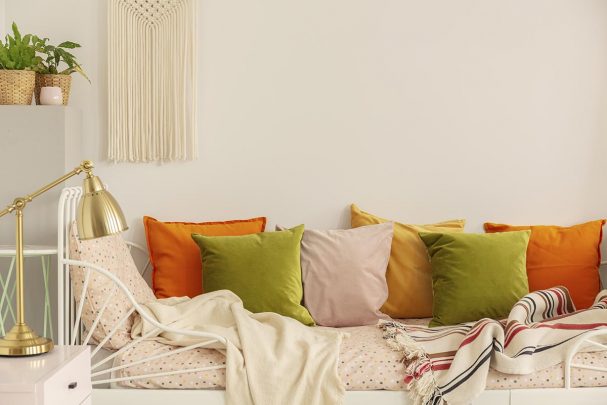
15 Top Summer Colors for the Home
There are so many fun colors that you can use for the home. I want to review some of the beautiful options I’m seeing for 2021 home décor trends! Use some of these color combinations in your home and office to help support your weaker chakras and remind yourself of your goals all day long!
Yellow and Gray
Pantone announced PANTONE 17-5104 Ultimate Gray + PANTONE 13-0647 Illuminating as the 2021 Pantone Colors of the Year! This color combo brings about feelings of hope and light, along with gentle strength. It would look beautiful in a hallway, or lighting up an area of your living room.
Vibrant Green
Bring in deep, vibrant green for a boost of energy to any place. Use succulents or potted plants to really bring your space to life! Think tropical trees, calming forests or luscious flowering gardens!
Peachy-Pink
Warm pink with a little peach brings a retro color into your powder room, bedroom, entryway or wherever! Use this color as an accent with one of the blue colors popular this year or use it as a primary color for a space and accent in pewter for a modern spin on an old color scheme.
Bright Red
This color is attention-grabbing and can easily be added with a bouquet of fresh flowers or a beautiful glass accent piece. Even the smallest items in bright red are going to bring energy to a room and add a focal point. Use red accents throughout the room and then pick a fantastic piece of wall art that contains your bright red color to really pull the space together. A little will go a long way with this color, so it might work better as an accent than a main color in most spaces.
This color can be especially stunning in outdoor spaces. Plant poppies, roses, carnations, bachelor buttons, petunias, dragons breath, burning bushes, zinnias, geraniums or other red flowers to add this color to your gardens for beautiful summer reds!
Soft Blue
Similar to faded denim, the soft blue color brings calm and stability to a space. This soothing color can feel so enriching with the golden summer sunlight streaming in. This is the color of serenity and peace. Offices, living rooms, bedrooms—there aren’t any bad spaces for this color! Pair it with dark wood finishes for a modern update to this classic décor color.
Saturated Blue
A wonderfully cool summer vibe comes from a deeply saturated blue color. It feels jazzy and contemporary, yet sensible in some way. You can use it for a very bold wall color, or opt for stunning blue cobalt glasswork as part of your accent pieces. You might have already noticed how many home and garden stores are carrying saturated blue pots! Use saturated blue as an outdoor accent color with pots for your flowers and cushions for your furniture.
Dark Wood
Dark woods contrasted with white walls are trending right now! Brighten up your space and go for a very classy look when you choose a mocha cherry, dark walnut or deep maple color. A dark ash stain with silver room accents can add a more modern approach to this contrasted look. Dark stains look fantastic with so many of the trending colors, like melon, teal, aqua, blush, and warm yellow.
Melon
Melon is a bolder shade of orangy pink (think Pantone color 16-1442 TCX). It has a warm, inviting feel that is very summery. It makes a great accent color and pairs exceptionally well with the dark wood and white color scheme! It can make a great kitchen for a color, bringing in a modern twist on the classic red or vintage pinks!
Pewter
Panton 18-5203 is a warm, bold grey. This is a great neutral that looks fantastic in any part of your home. It’s easy to pair with almost any other color and has just a touch of warmth so it isn’t too harsh. Get swatches to find out what color of pewter looks best in the specific light of the space you are going to use it in, since it can vary based on whether your light is more blue or yellow. Pewter is beautiful with lighter wood finishes, marble countertops and silver finishes.
Blue-Green
I love a good blue-green color! The cool energy of this mix is revitalizing and supports the heart and throat chakras, empowering you to speak up for yourself and others. It is the aura color of truth and serenity. Look for beautiful colors of teal, aqua, turquoise, sea green and more. You can go for more muted blue-green colors for an earthy look or bold and vibrant hues for a more creative and energetic vibe.
Off-White
Warm and less harsh than pure white, off-white is a highly popular color when you are selling a home. Your realtor is going to want you to paint any bold rooms off-white. That is because it is calming, stable and applies easily to anyone’s style. Use it in spaces where the focal point is something else, like stunning artwork on the walls or eye-grabbing flooring!
Warm Yellow
Yellow is such a comforting and invigorating color. Pick the warm color of sunlight, pairing it with pinks or oranges for a sunset feeling. You will feel drawn to this space because of its natural warmth and power.
Blush
The color of pale pink with just the smallest hint of orange undertones makes a blush color. This warm color is a soft addition to any space. It makes a perfect baby girl nursery and it can be a great color in a bathroom with a sea theme to help balance out the aquamarine colors.
Cool Gray
A light cool grey color can be used in so many spaces to help accent other aspects of the space. Cool grey is a neutral that is ideal for kitchens, bathrooms and so much more! It can make a really cool accent color if you go with a bolder wall color, like saturated blue or navy.
Navy
Moody and classic, navy is a great color for a striking décor statement. Use it for walls in a naturally darker space, like a dining room or bedroom, to provide feelings of peace and calm. This color improves focus, but it can make any space dark quickly and mutes a lot of natural light.
Spring Colors for Your Energy Type
I think how you naturally view the world says a lot about the balance of your chakra systems and your overall personality. If you aren’t sure about your Energy Type, I recommend taking this Energy Type quiz for a better understanding of your natural tendencies. Based on these results, I can recommend colors for you to wear and surround yourself with.
Are you ready to use color to your advantage?
We know you’ll also love: