Color is an excellent way to express our sense of style and appreciation for beauty. But, did you know that color also helps you embody certain characteristics, moods, or energies? Let’s talk about popular colors for spring!
Every year, styles change. Clothing, accessories, home décor, fresh wall colors, and nail colors are all examples of ways you can draw important colors into your life. I can help you choose from top color trends for 2021 to empower the parts of you that need more support for a better balance of energies.
In my system of Energy Profiling and Dressing Your Truth, I teach that there are 4 Energy Types, and every single person expresses a dominant Type. You can easily find out which one you are by going through my free Beginner’s Guide here. When you discover your true Energy Type, everything in your world will start to make sense!
What is the Color Palette for Spring 2021?
Before we get into the color palette, I want to encourage you to grab your Style Kit. This will help you immediately know whether or not one of the trending colors is best for your Energy Type!
When looking to see if a color belongs to a certain Type, you want that color to harmonize with the other colors on that specific Style Guide. The color will look as though it could be another square on the card. If it looks like it “jumps out” or “stands out” from the rest, you can be confident it’s not that Type!
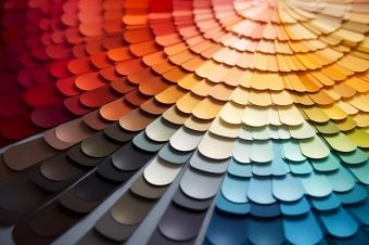
Pantone Color Institute is always a key part of choosing top colors and noting how color trends are being used on Fashion Week New York runways. This year Pantone noted that the palette for spring was “friendly and relatable.” The colors are a fantastic blend of the classics with youthful vibes. Hot flame scarlet to reliable faded denim, you can get all kinds of looks out of the spring color palette for 2021.
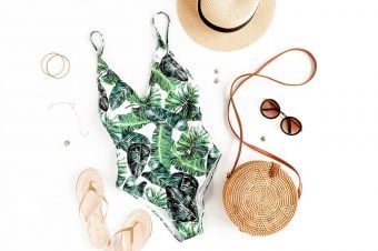
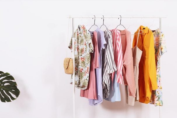
You can look through your closet and makeup drawer to pull these colors out as trendy items for this season. If you are needing a new pair of shoes or sunglasses, check out the popular 2021 style colors before you go shopping! If you are repainting a wall or purchasing a few room accents, this It a great guide to hold you get started.
Spring Colors You Can Wear Year-Round
The best part about this palette is the longevity. You will appreciate how these colors are going to work well in fall or winter looks. There is no point in the kind of fast fashion that changes so fast you don’t even hardly wear your items before they are back out of style. Choose trendy looks that will stay hot for a season or two at least!
Flame Scarlet
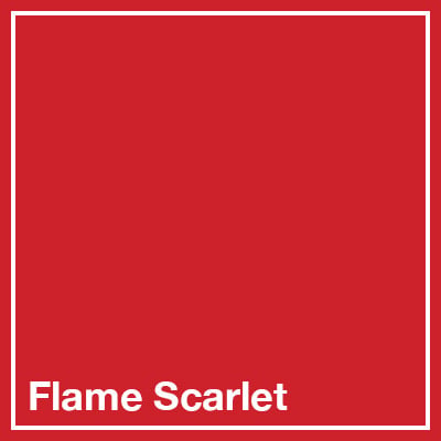
Hot, fiery red is a fierce color that will empower your root chakra into movement. This the color of fire, passion, and intense energy. Flame scarlet is a great color for any piece, as well as a hot lip color or catchy nails. You will feel energy and empowerment when you get this color around you. A dress or blazer in flame scarlet just screams confidence and action.
Grape Compote
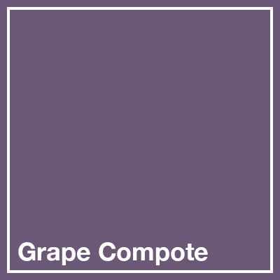
Slightly darker than lilac, grape compote is a soothing color that brings a sense of enlightenment. Purple is the color of the first chakra (or Sahasrara chakra) that brings knowledge. Grape Compote is a beautiful and mysterious color to wear for many and shouldn’t be hidden under layers or within patterns. The amethyst makes inspirational jewelry for helping you heal the Crown Chakra.
Faded Denim

If your jeans are too fresh and straight up, you can always toss little bleach on your jeans. The faded look offers that comfortable and relatable feeling to your wardrobe. You can choose jean jackets, jeans, jean shorts and jean skirts that have this color. The worn jeans are often the most comfortable pair you own!
Biscay Green
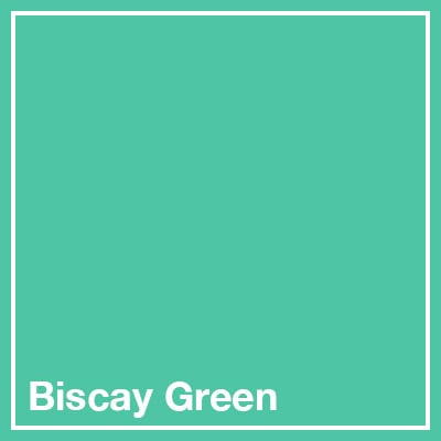
Bright, fresh, and refreshing, Biscay green looks like a sweet variation of mint. This crisp color is pretty in pops of fingernails, bags, shoes, jewelry or eyeshadow. You can even choose it for your main clothing piece if you really want to bring on the soothing, yet refreshing energies. The heart chakra is the Energy Center that tends to be most impacted by green colors, opening you to deeper love, supportiveness, and compassion.
Coral Pink
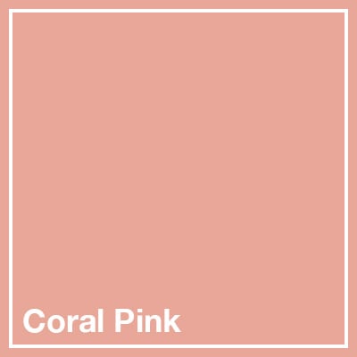
Coral is one of those colors that is a mixture. It has little orange, a little red and white, making it a color that supports the root chakra as well as the sacral chakra. Coral pink has a little more red, so it is more in tune with the feminine root chakra. It is soothing and feels like a soft embrace when you look at it. Dresses, lipstick, shirts, ties, scarves, bags, nail polish, heels—just about anything you might want to wear could be found in this color.
Saffron Yellow
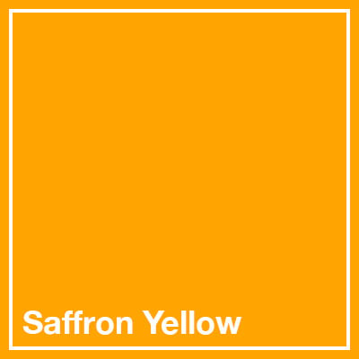
Yellow is the color of power and energy. It is a color that represents the fire and warmth of the sun—which brings life to things on earth. It is the color that supports your solar plexus chakra and brings inner power. Saffron yellow is an earthy yellow color you might find on sunflowers or freshly turning yellow leaves in the fall. This color can make an eye-catching dress, shoes, or cardigan if you want to subconsciously encourage self-love and confidence.
Chive

Another earthy color, chive is just a slightly lighter color than an olive green. It looks great on every skin color and can be worn as pants, shirt, scarf and so much more. This savory herbal color encourages personal health and restoration. Again, green is the color for the heart chakra, so choose this color for improving heart health and power, driven by your empathy.
Orange Peel
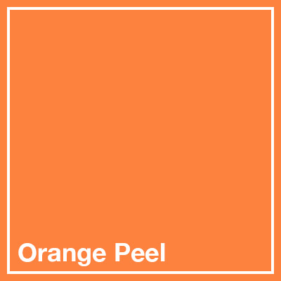
The color of the Sacral Chakra is orange. This sharp and energetic orange color might be just what you need to ignite that fire within. This is the color everyone will notice, so it makes sense that this is the color associated with friendliness, creativity, happiness, and passion. A little will catch the eye, but wearing a lot of Orange Peel will pull all eyes to you!
Sunlight
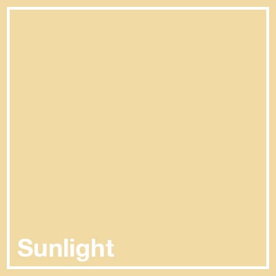
This light yellow color is a mixture of purity and warmth. It pairs well with a bold or dark shade of blue for a classic look that draws energy. Sunlight doesn’t flatter some of the paler skin tones, but you can always choose it for accessories or within a pattern instead of large clothing pieces.
Brilliant White

Pure, ethereal, elegant—white is often associated with simplicity and power. Sometimes white is considered the color of knowledge or associated with the crown chakra (along with purple). It may be harder to keep clean, but the right white outfit or shirt can help draw your focus to insight and wisdom from Source.
Timeless Spring Décor Color Combinations for Home Décor Refreshment
Color schemes for the home are a bit different than trending palettes of top designers. If you are doing a remodel, consider these awesome color choices for 2021.
Classic Blue
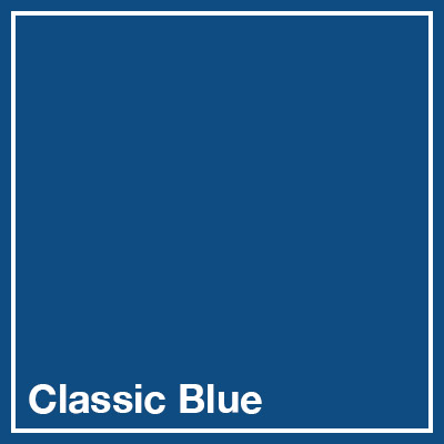
Pantone’s Color of the Year for 2020 was classic blue. This can be a stunning color in just about any room. Kitchens can use cobalt glass or blue china patterns for accents. On the patio, blue pots or patio furniture can really grab the eye. Ocean décor for bathrooms can be a cool look. Blue is a classic color that conveys dependability and deep contemplation. Pittsburg Paint also selected a blue blend of navy and cobalt (called Chinese Porcelain) as their 2020 Color of the Year.
Mint & Pistachio
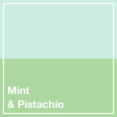
The two light, natural green colors provide a great combination for a home that looks down-to-earth and connect with nature. This is a beautiful color palette for a patio space, dining room, living room or office space where you want a sense of peace and energy.
Canary Yellow & Kelly Green
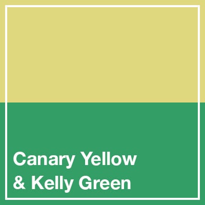
Make things pop with energy by combining two bright, powerful colors. Kelly green and Canary yellow are a great choice for a kitchen, where you want that fresh look of limes and lemons.
Ballet Slipper Pink
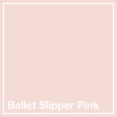
The soft pink color of ballet slippers (or even that Coral Pink from above) offers a warm and welcoming color perfect for an entryway, dining room or family room. Valspar called their 2020 color Bombay Pink. Pair your light pink color with pistachio or parchment for a pretty contrast that feels natural and comfortable.
Navy

According to Sherwin Williams, Naval was the 2020 Décor Color of the Year: “a rich navy hue that strikes a balance between calm and confident.” This is the color that brings both glamour and grounded serenity. Use navy for patio furniture, wall colors, and accent pieces. This classic color is luxurious and pairs well with most other finishes—like warm woods, metals, and marble.
Raspberry
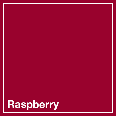
The deep and luscious color of raspberry makes a brilliant pop for your living spaces and sparks your root chakra. Pair it with more natural colors on the wall, like celery green, pistachio, or saffron yellow, for a youthful take on a classic-looking space.
Aqua or Teal
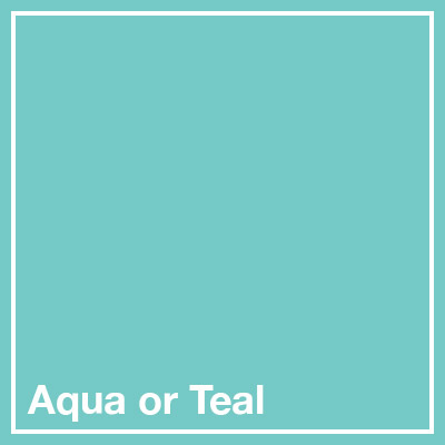
You can choose from earthy teal to bright aqua for spaces where you want to increase the feeling of energy and focus. These colors pair so well with saffron yellow, raspberry, or mint. Aqua and teal both are colors of light blue with varying amounts of green in them. You can choose an aqua or teal color with a tiny bit of brown to mute it into a more earthy shade for a grounded energy.
Spring Colors for Your Energy Type
I think how you naturally view the world says a lot about the balance of your chakra systems and your overall personality. If you aren’t sure about your Energy Type, I recommend taking this Energy Type quiz for a better understanding of your natural tendencies. Based on these results, I can recommend colors for you to wear and surround yourself with.
Are you ready to use color to your advantage?